
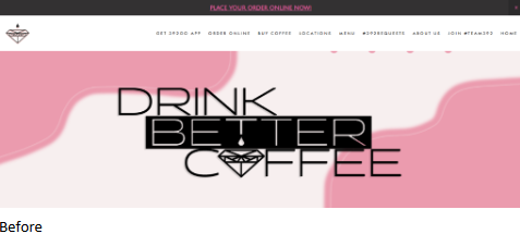
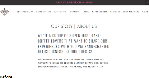
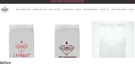
A WordPress site created for a local café to improve navigation clarity, typographic hierarchy, and overall usability while maintaining the existing brand identity.
Before and After
The final revisions provide a clean and professional user experience that aligns with the café’s goals.
- Simplified and clarified navigation hierarchy
- Refined typography for headings and body text
- Improved grid alignment and spacing consistency
- Enhanced readability for key content and SEO optimization



Leave a Reply